
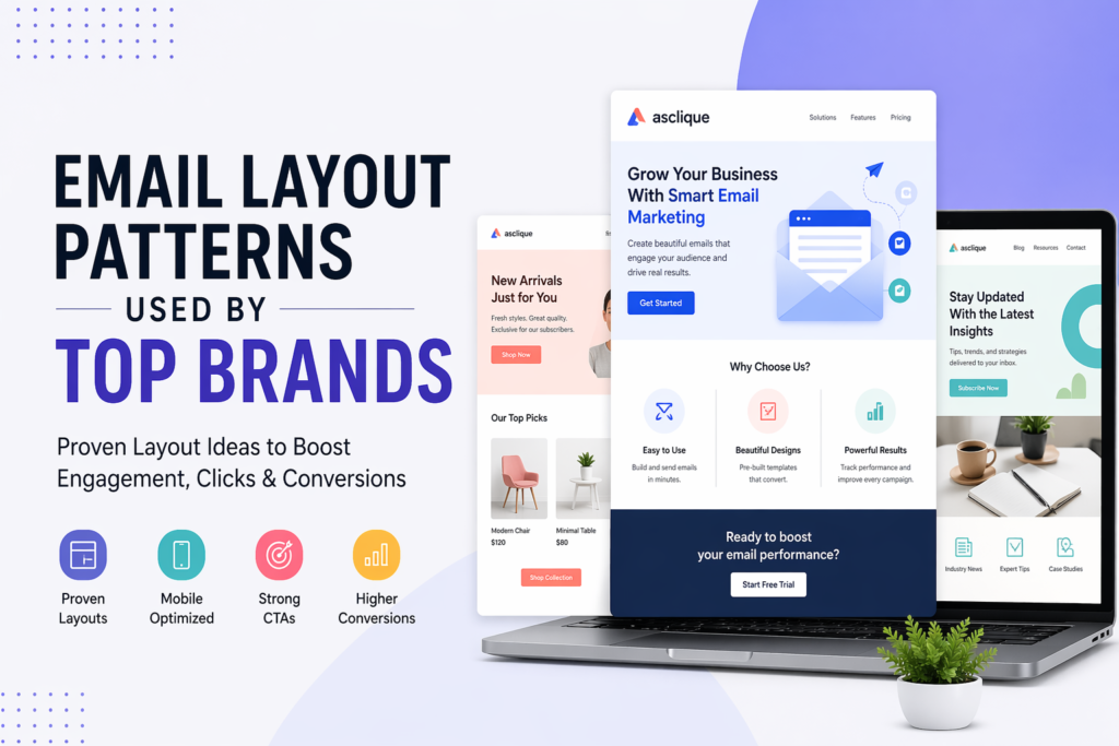
Designing effective email layouts is no longer just about aesthetics—it’s about guiding readers toward action. Top brands invest heavily in optimizing their structure, spacing, and hierarchy to ensure every message performs. Whether you’re working with a simple html email template or a fully customized branded email template, understanding proven layout patterns can dramatically improve engagement.
In this article, we’ll explore practical email layout examples, share actionable email layout ideas, and break down the patterns used by leading companies to boost open rates, clicks, and conversions.
Why Email Layout Matters More Than Ever
Modern users skim emails in seconds. That means your email layouts must be visually intuitive and strategically structured. A poorly organized message—even with great content—will fail to deliver results.
Top-performing brands rely on layouts that:
- Highlight key information instantly
- Maintain consistency with their branded email template
- Work seamlessly across mobile and desktop
- Support clear calls-to-action
Studying real email layout examples shows that clarity always beats complexity.
The Most Effective Email Layout Patterns
1. The Single-Column Layout
The single-column structure is one of the most widely used email layouts among top brands. It ensures readability, especially on mobile devices.
This layout typically includes a header, body content, and a call-to-action stacked vertically. Many email layout examples from companies like SaaS platforms and eCommerce brands follow this approach because it simplifies user flow.
2. The Inverted Pyramid Layout
This pattern guides the reader’s attention from a broad message to a focused action. It starts with a headline, narrows down with supporting content, and ends with a prominent CTA.
This is one of the most effective email layout ideas for conversions because it aligns perfectly with how users scan content.
3. The Grid-Based Layout
Retail and media brands often use grid layouts to showcase multiple products or stories. These email layouts allow users to explore options without overwhelming them.
A well-designed grid can still feel cohesive when built on a strong branded email template.
Key Elements of High-Performing Email Layouts
Visual Hierarchy
Every successful email layout example demonstrates a clear visual hierarchy. Headlines should stand out, supporting text should be readable, and CTAs must be impossible to miss.
Consistent Branding
A recognizable branded email template builds trust and familiarity. Top brands maintain consistent colors, fonts, and tone across all campaigns.
Mobile Optimization
Most users read emails on mobile devices. That’s why effective email layouts are responsive and easy to scroll through.
Common Email Layout Ideas Used by Top Brands
Here are some widely used email layout ideas that consistently deliver results:
- Minimalist layouts with strong typography
- Image-heavy designs for product showcasing
- Text-focused layouts for storytelling
- Interactive elements like buttons and GIFs
- Personalized sections based on user behavior
These email layout examples prove that there’s no one-size-fits-all approach—success depends on your audience and goals.
How to Choose the Right Email Layout
Selecting the right structure depends on your objective. Follow this simple process used by top marketers:
- Define your goal (conversion, awareness, engagement)
- Choose a layout that supports that goal
- Align it with your branded email template
- Test multiple email layout examples
- Optimize based on performance data
This approach ensures your email layouts are not just visually appealing but also results-driven.
Mistakes to Avoid in Email Layout Design
Overloading Content
Too much information can overwhelm readers. Even the best email layout ideas fail if they lack focus.
Weak Call-to-Action
A strong CTA is essential. Many email layout examples fail because the action step isn’t clear or compelling.
Ignoring Brand Consistency
Without a cohesive branded email template, your emails can feel disconnected and untrustworthy.
Poor Spacing and Alignment
Cluttered email layouts reduce readability and hurt engagement. Clean spacing is key.
Final Thoughts
The best email layouts are built on simplicity, clarity, and strategic design. By studying proven email layout examples and applying practical email layout ideas, you can create campaigns that not only look professional but also perform exceptionally well.
Remember, your branded email template is more than just a design—it’s a reflection of your brand identity. Whether you’re using a basic html email template or a custom-built solution, the right layout pattern can make all the difference.
Focus on user experience, keep testing new approaches, and refine your strategy based on real results. That’s exactly how top brands stay ahead.
FAQ
What is the most effective email layout for improving engagement and conversions?
The most effective layout depends on your goal, but the single-column layout consistently performs best across industries. It simplifies the reading experience, especially on mobile, and creates a clear flow from headline to CTA. For conversion-focused campaigns, the inverted pyramid layout is highly effective because it visually guides the reader from a broad message to a specific action. High-performing brands often combine both approaches to maintain clarity while driving action.
How do I choose the right email layout for my campaign?
Start with your primary objective. If your goal is conversions, use a focused layout like the inverted pyramid with a strong CTA. For product showcases, a grid-based layout works better. For storytelling or newsletters, a text-heavy or hybrid layout is ideal. The key is alignment between goal, content type, and user behavior. Top brands always design layouts around outcomes, not aesthetics.
Why is visual hierarchy important in email layouts?
Visual hierarchy determines how easily a reader can scan and understand your message. Users typically spend only a few seconds on an email, so important elements like headlines, key benefits, and CTAs must stand out immediately. This is achieved through font size, contrast, spacing, and positioning. Without a clear hierarchy, even strong content gets ignored.
What role does a branded email template play in performance?
A branded email template ensures consistency across campaigns, which builds familiarity and trust over time. It also speeds up production and reduces design errors. More importantly, consistent branding improves recognition, which can positively impact open rates and engagement. Top brands treat their email templates as an extension of their overall brand identity.
How can I optimize my email layout for mobile users?
Use a single-column structure, keep text concise, use large and tappable buttons, and ensure images scale properly. Font sizes should be readable without zooming, and spacing should prevent accidental clicks. Avoid heavy designs that slow loading times. Mobile optimization is not optional anymore, it directly impacts engagement and conversions.
How many CTAs should I include in an email layout?
One primary CTA is recommended for most campaigns, especially if your goal is conversion. Multiple CTAs can be used in content-heavy or product-based emails, but they should be visually distinct and not compete with each other. The reader should always know what the main action is.
What are the most common mistakes brands make in email layout design?
The biggest mistakes include overcrowding the email with too much content, weak or unclear CTAs, poor spacing, lack of mobile optimization, and inconsistent branding. Another major issue is designing for aesthetics instead of usability. High-performing email layouts prioritize clarity, simplicity, and action.
How do top brands test and improve their email layouts?
They rely on A/B testing and performance data. This includes testing different layouts, CTA placements, headline styles, and visual elements. Metrics like open rate, click-through rate, scroll depth, and conversion rate are analyzed to refine future campaigns. Continuous testing is a key reason top brands outperform others.
Are image-heavy or text-heavy email layouts better?
It depends on the purpose. Image-heavy layouts work well for eCommerce and product showcases, while text-focused layouts are better for storytelling, newsletters, and thought leadership. The best approach is often a balanced mix where visuals support the message rather than dominate it.
How does spacing and alignment impact email performance?
Proper spacing improves readability and reduces cognitive load. Clean alignment helps guide the reader’s eye naturally through the content. Poor spacing makes emails feel cluttered and overwhelming, which leads to lower engagement. Top brands use whitespace strategically to highlight key sections and improve overall user experience.