Building a design system is easy. Keeping it alive is the hard part.
Most product teams fail to maintain a consistent visual language not because they lack talent, but because they lack time. They cannot afford to dedicate a full-time designer to draw every arrow, folder, and user avatar required as a product scales.
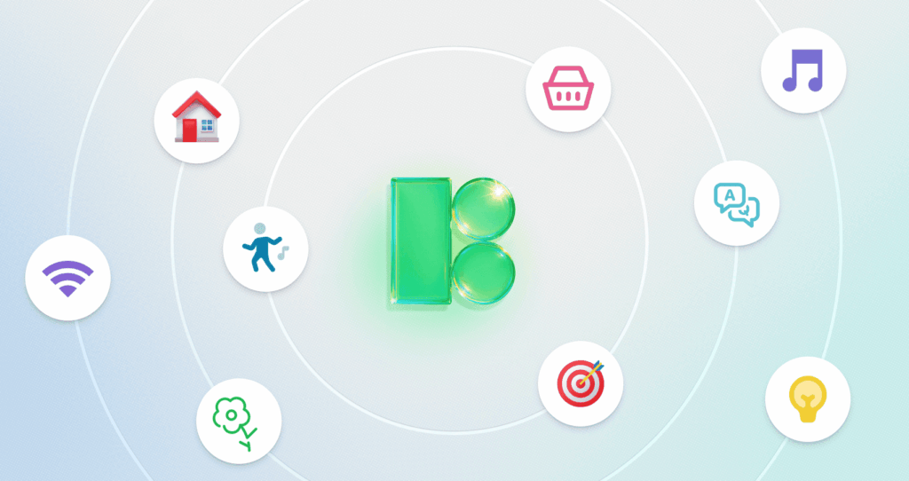
Icons8 Icons solves this. It isn’t just a bucket of assets; it is an enforcement mechanism. With over 1.4 million icons, the platform functions like an outsourced design arm that adheres to strict interface guidelines. It keeps your visuals aligned whether you are building for iOS, Windows, or a custom web brand.
The Architecture of Consistency
The real power here lies in the “pack” structure. Search for “home” on most stock sites, and you get a mess-thick lines mixed with filled shapes and cartoons. That fragmentation kills UI consistency.
Icons8 organizes its 1.4 million assets into 45+ distinct visual styles. Pick the “iOS 17” style, and you get 30,000 icons that strictly follow Apple’s rules regarding stroke width and corner radius. Switch to “Windows 11,” and 17,000 icons match Microsoft’s fluent design system. You rarely hit a dead end where you have to switch styles or draw a missing piece yourself.
Scenario: The Native App Overhaul
Picture a UI designer tasked with modernizing a legacy Android application. The old app is a wreck of FontAwesome icons and custom PNGs created by a designer who quit three years ago. The goal is simple: bring the app in line with modern Material Design standards.
The designer selects “Material Outlined” in the library. This filters the search to 5,573 icons that match the specific geometric constraints of Android’s system. They install the Figma plugin to work directly in their design environment.
Standard icons like “account,” “security,” and “notifications” are easy to find. But as they build the settings menu, they need niche metaphors: “fingerprint scan error” and “NFC transaction.” Because the library is deep, they find these specific concepts with the exact same stroke width as the standard icons.
For the developer handoff, the designer doesn’t need to manually export assets. They use the collection feature to gather the selected icons. The developers want vector data for scalability, so the designer exports the set as SVGs. If the team prefers a font file to keep the bundle size low, the designer generates an icon font directly from the collection. The result is a cohesive interface that looks native to the platform, achieved without drawing a single vector path.
Scenario: The Marketing Presentation
A product marketing manager is building a launch deck. They aren’t a designer, but they know mismatched clipart makes a presentation look amateurish. They need visuals that are engaging but consistent with the company’s “friendly and modern” brand voice. Stark UI icons won’t work here.
The manager browses “3D Fluency” and “Liquid Glass.” These aren’t flat lines; they are rendered 3D assets and glossy illustrations. They find a “rocket ship” for the launch slide and a “target” for the strategy slide.
But the default colors clash with the company’s purple branding. Using the in-browser editor, the manager clicks on the icons before downloading. No Photoshop needed. The editor lets them recolor elements, make the background transparent, and tweak padding to ensure the image isn’t cropped tightly.
They download the assets as high-resolution PNGs (up to 1600px) to ensure they look crisp on a 4K conference room screen. For the final “Thank You” slide, they grab a JSON (Lottie) version of a waving hand to embed in the web version of the deck.
A Narrative: Fixing the Dashboard
Ravi, a frontend developer, is rushing to finish an admin dashboard before a Friday release. The design specs are loose wireframes, so high-fidelity decisions fall on him.
He opens the Pichon Mac app, which allows him to drag and drop icons directly into his code editor. He needs a navigation set. He searches for “dashboard,” “analytics,” and “users.” He drags them into his project folder.
Halfway through, he realizes the “users” icon looks too generic. He wants something that represents “team” better. He searches “team” and finds a three-person cluster. It matches the style of the other icons perfectly.
Later, the project manager points out that the brand color changed from blue to teal. Ravi doesn’t re-download everything. He goes to his “Dashboard Project” collection on the Icons8 site where he saved his selections. He uses the bulk recolor tool, pastes the new HEX code, and instantly updates the entire set. He re-exports the SVG sprite.
Finally, he needs a social footer. He grabs a youtube logo from the Logos category. Since this falls under “Logos,” he downloads the vector SVG format for free.
Comparison with Alternatives
Icons8 vs. In-House Design
Building an in-house set offers maximum control but requires immense maintenance. Every time a new feature needs a new metaphor, a designer must draw it. Icons8 acts as an external maintainer. The trade-off is that you don’t own the IP, but for functional UI elements, exclusive ownership is rarely necessary.
Icons8 vs. Open Source (Feather / Heroicons)
Open-source packs like Feather are excellent for small projects and offer clean code for free. But they are limited. Feather has a few hundred icons. If you need a “sushi” icon or a “medical cross,” you likely won’t find it. Icons8 wins on volume while maintaining the same level of stylistic rigidity.
Icons8 vs. Noun Project
The Noun Project has massive variety, perhaps even more than Icons8, but it lacks standardization. You might find ten “dog” icons, but one is a line drawing, one is a silhouette, and one is a sketch. Mixing them requires significant manual editing. Icons8’s “pack” system ensures that if you stay within a style, every icon shares the same visual DNA.
Limitations and Trade-offs
The library is extensive, but the licensing model creates friction for certain workflows. The free tier works for prototyping, but the 100px limit on PNGs is too low for modern retina displays. Link-back requirements are often not feasible for professional client work. Realistically, professional use requires a paid subscription.
Vector (SVG) access is locked behind the paywall for most categories. Developers who prefer working with SVGs for responsiveness will find the free plan insufficient unless they strictly use the Logos, Popular, or Characters categories.
“Choice paralysis” is another risk. With 45+ styles, it is easy to pick a style that looks good in isolation (like “Color Hand Drawn”) but scales poorly when the app grows. Sticking to the major platform styles (iOS, Material, Windows) is usually the safest bet for software.
Practical Tips for Workflow
Use the “Request” Feature
If you hit a rare gap in the library, use the icon request feature. Unlike many support voids, this system is active. If a request gets 8 likes from the community, the design team produces it. This works well for long-term projects where you can anticipate future needs.
Check “Simplified SVG” Settings
By default, the system simplifies SVGs to reduce code size. This helps web performance but annoys designers trying to edit paths in Illustrator or Figma. If you need to modify the geometry, uncheck “Simplified SVG” in the settings before downloading to get the editable paths.
Embed via CDN for Rapid Prototyping
For internal tools, don’t clutter your project folders. Use the CDN link option to embed the icon directly into your HTML. You can tweak the size and color via URL parameters, allowing for fast iteration in the browser without re-uploading assets.
Master the In-Browser Editor
Before downloading, use the editor to add a “square” or “circle” background. This helps create consistent app launcher icons or feature grids where every icon needs to occupy the same visual weight. Set the padding and background radius once and apply it to your selection.

