
Some digital experiences hold attention with almost no effort. Others lose users within seconds. The difference rarely comes from visual polish alone.
People stay when an experience gives them a clear reason to continue.
A useful article answers the question raised by its headline. A search tool returns a relevant result. A dashboard shows what changed. An interactive platform responds when the user takes an action. In each case, attention follows feedback.
Speed matters too. When a button responds at once, the connection between action and result feels clear. A slow or uncertain response breaks that connection. Users may click again, leave the page, or assume something failed.
Clarity has a similar effect.
People constantly make small decisions online. Should they scroll further? Open another page? Watch the next clip? Change a filter? If an interface makes the next step obvious, continuing requires little mental effort. Confusing navigation creates friction and gives users a reason to leave.
Uncertainty can also hold attention when used carefully. A live score, changing price, incoming message, or unfolding story creates an unanswered question. The user wants to know what happens next.
Yet uncertainty alone is not enough. Strong engagement combines curiosity with control. Users need to understand what they can do, see how the system responds, and receive enough value to justify another minute of attention.
That basic exchange sits behind many successful digital experiences. The interface asks for attention, and the user expects something useful, interesting, or meaningful in return.
Fast Feedback Turns Simple Actions Into Engaging Experiences
Immediate Responses Make Interfaces Feel Predictable
A digital product feels responsive when each action produces a clear result.
Tap a button and the next screen opens. Change a filter and the list updates. Send a message, and a status mark confirms that the system received it. These small responses tell users that their actions worked.
Delays create doubt. A user may wonder whether the tap registered or whether the app has frozen. Even a short pause can feel long when there is no sign of progress.
This makes perceived speed almost as important as technical speed.
Mobile Products Have Less Room For Friction
Phones make these problems more visible. Screens are small, connections can change, and users often interact while walking, commuting, or switching between tasks.
Teams that provide mobile app development services therefore have to think beyond raw loading time. Navigation depth, touch targets, screen transitions, offline behavior, and clear feedback all affect how quickly an app feels.
A fast server cannot rescue a confusing interface.
Progress Creates a Reason to Continue
Feedback also shows users that they are moving toward something.
A progress bar shows how much of a task remains. A completed step confirms that information was saved. Search suggestions narrow a large set of choices into a manageable group.
Each response reduces uncertainty.
The same principle explains why interactive tools often hold attention better than static pages. Users do something, observe the result, and decide what to do next. The experience becomes a loop of action and feedback rather than a one-way flow of information.
Good Feedback Does Not Demand Attention
More feedback is not always better.
Constant pop-ups, sounds, animations, and alerts can compete with the task itself. Useful feedback should answer a practical question: What happened after the user acted?
When an interface answers that question quickly and clearly, users spend less effort understanding the product. They can focus on what they came to do.
Curiosity Works Best When Users Know Where They Are Going
An Information Gap Creates a Reason to Continue
Curiosity begins when people know enough to form a question but not enough to answer it.
A headline may reveal the problem while leaving the solution inside the article. A live dashboard can show that a metric has changed before explaining why. A product comparison may introduce several options before revealing how they differ.
This creates an information gap. The missing piece gives the user a reason to keep reading or interacting.
The gap must remain manageable. If a page hides basic information or forces users through several unnecessary steps, curiosity turns into frustration.
Clear Structure Protects Attention
People rarely give a page unlimited time to explain itself.
Headings, labels, menus, and short content blocks help users understand where they are and what comes next. This reduces the mental work needed to navigate the experience.
Good structure also lets people move at their own pace. Someone who wants a quick answer can scan. A user who needs detail can continue deeper.
That sense of control matters because engagement is stronger when continuing feels voluntary.
Personal Relevance Makes Information Harder To Ignore
People notice content that connects with their current goal.
A generic dashboard may contain hundreds of numbers. A personalized dashboard that highlights the five metrics relevant to a user’s work becomes easier to process.
Search engines apply the same principle. The value comes not from showing the largest possible amount of information, but from placing the most relevant information near the top.
Digital products can use context in similar ways. Saved preferences, recent actions, selected filters, and account settings can reduce irrelevant choices.
Surprise Needs a Stable Framework
Unexpected content can refresh attention, but constant surprise makes an interface difficult to learn.
Users need stable navigation, predictable controls, and clear rules. Within that framework, fresh content or changing results can create interest without causing confusion.
The strongest experiences therefore balance novelty with familiarity. Users understand how the product works, yet they still have a reason to discover what comes next.
Trust Turns Attention Into Lasting Engagement
Predictability Helps Users Feel in Control
People return to digital products when they understand how those products behave.
A familiar button should perform the same action each time. Navigation should not change without a clear reason. Important settings should remain where users expect to find them.
This consistency reduces mental effort. Users spend less time learning the interface and more time completing the task.
Predictability does not mean boredom. Content can change while the rules of interaction remain stable.
Clear Information Reduces Hesitation
Trust also depends on knowing what will happen next.
Before users submit a form, start a process, or change a setting, the interface should make the result clear. Labels such as “Save,” “Delete,” and “Send” work because they describe a specific action.
Vague controls force people to guess.
The same principle applies to content. Clear dates, sources, prices, and status information help users judge what they see. Missing context makes even a polished page feel less reliable.
Control Makes Engagement More Sustainable
Users should have practical ways to shape their experience.
They may want to pause notifications, change recommendations, edit preferences, undo an action, or leave a process before completing it. These controls reduce pressure because the user knows that interaction remains optional.
This matters for long-term engagement. A product that constantly demands attention may produce more clicks in the short term, but it can also create fatigue.
Good engagement serves a purpose.
The strongest digital experiences do not hold attention simply for the sake of keeping someone on a screen.
They help users accomplish something.
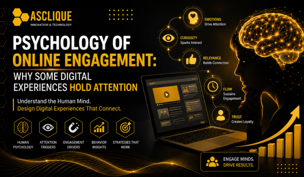
Fast feedback shows that an action worked. Clear structure makes the next step easy to find. Curiosity encourages exploration. Personal relevance removes noise. Trust gives users confidence to continue.
These elements reinforce one another.
A slow product can weaken curiosity. Confusing navigation can damage trust. Constant alerts can turn useful feedback into distraction.
Effective engagement therefore comes from reducing friction while increasing useful response. When users understand what is happening, see value in continuing, and remain in control of their choices, attention becomes a natural result of a well-designed experience rather than something the interface has to force.